
Quality and performance
Quality shows how much of what you designed actually reaches the agent; Performance shows how long assembly takes. Both live on the Observe tab, with the same filters as Usage — Domain, Library, Artifact, Surface, Level, Format.
The two quality percentages are entity measurements. A brief or skill is served whole or not at all — there is no field funnel to survive — so those loads carry no coverage numbers; filter the Library to Briefs or Skills and the funnel goes quiet while errors and assembly time keep reporting. Failures in any library still land on Issues.
How it works
Every load runs a three-stage funnel:
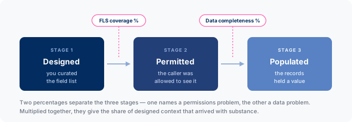
Two percentages separate the stages, so you know whether to fix a permission set or a data problem. Both are load-weighted daily averages — an entity loaded 100 times counts 100 times. Multiplied together, they give the fraction of designed context that arrived with substance.
FLS coverage %
Of the fields the entity is designed to deliver, the share the caller was allowed to see (accessible ÷ requested). Fields a user can’t access are silently stripped — the agent answers from thinner context with no sign anything is missing. 100% means every caller received exactly what you designed.
When it dips, Issues names the stripped fields under fls_strip. Fix the permission set, or remove the field from the entity.
TIP
Low FLS coverage is what usually explains “the agent doesn’t know about X” when preview shows X fine — preview runs as you, not as the caller.
Data completeness %
Of the fields the caller could see, the share that actually held a value (populated ÷ accessible). Low completeness means the entity is designed around fields that are rarely populated — get the field populated, or take it out of the entity.
Reading them together
| FLS | Completeness | Diagnosis |
|---|---|---|
| High | High | Working as designed |
| Low | High | A permissions problem — the audience can’t see what you built |
| High | Low | A data problem, or over-curation — fields are empty |
| Low | Low | Both. Start with permissions — completeness is measured over what survived |
Field-grain coverage is recorded too, so you can find which field drags the number.
The page’s two charts split by question rather than by metric: one line chart holds Complete % and FLS % on a shared 0–100 axis (how grounded are payloads), and a column chart holds errors and issues per day (what is going wrong). When the lines dip and the columns rise together, start with Issues — it names the cause.
Performance
Observe → Performance shows assembly time, with the same filters and shape. Cost is dominated by queries:
| Part | Cost |
|---|---|
| Fields | One query for the record |
| Metrics | Batched — all metrics on a payload in one aggregate query |
| Formulas | None — evaluated in memory |
| Each related list | Its own query |
| Each reference | Its own query |
| Each enrichment | Runs its own code — typically a query per record |
Ten metrics cost about what one costs; ten related lists cost ten queries. Choosing between a metric and a list for the same information, the metric is cheaper on both axes.
If one entity is slow, count its enrichments first — three or four Apex providers is usually the whole answer. Raising their minimum level to detailed takes them off leaner payloads.
Both pages take a timeframe and export to CSV, so you can track a curation change over weeks or report outside the Studio.